
Quick Actions Improvement
Turning the lowest-performing homepage feature into a marketing-driven growth lever
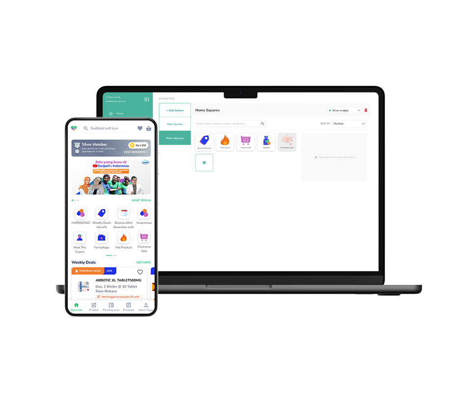
Overview
The pharmacy app’s homepage featured a static row of quick-action category icons. Mixpanel data showed it was the worst-performing element on the entire platform: 0.09% click-through rate, while search led at 35.19%. Instead of just restyling the icons, we rebuilt quick actions as a dynamic, marketing-managed system and increased
Type
Mobile App and responsive website (content management platform)
My role
Senior UI UX designer
What I did
Benchmarking, User Stories, Wireframes, Interactive Prototypes, User Testing, UI design
Impact
- Achieved a 50% increase in the overall click-through rate (CTR) of homepage quick actions.
- Shipped a self-service marketing dashboard, removing engineering dependency for homepage campaign changes and enabling targeted retention strategies
The Problems what the data said
Two data sources framed the problem:
- Behavioral analytics (Mixpanel): Quick actions converted at 0.09% post-homepage-view — dead last among all call-to-action elements. Search converted at 35.19%. Users had effectively learned to ignore the quick actions.
- User research: Most users searched for products by name rather than browsing categories, and results appeared instantly — so static category icons offered no advantage over typing.
The conclusion: the feature wasn’t failing because of visual design. It was failing because static, generic content couldn’t compete with intent-driven search.
Competitive Audit – understanding why
I audited major e-commerce platforms and found a consistent pattern: the ones with high-performing homepage modules used personalized, frequently refreshed content. Customers have grown resistant to generic, unchanging promotions — which explained our flat 0.09% CTR. The insight shifted our goal from “redesign the icons” to “make the content dynamic and give marketing the tools to keep it relevant.”
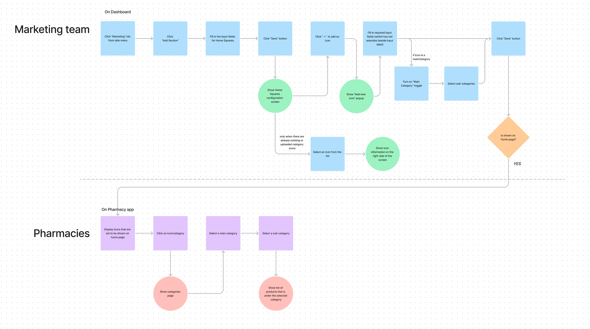
The Solution – two products, one system
This meant designing for two user groups simultaneously:
Marketing team (CMS dashboard): A configuration flow to create, edit, and publish quick-action sections — add icons, assign categories and sub-categories, toggle homepage visibility. I mapped the full flow in FigJam before wireframing to catch edge cases (e.g., what happens when a category has no uploaded icon) early.
Pharmacies (mobile app): A homepage where quick actions reflect current campaigns and lead into structured category → sub-category → product journeys.
Because marketers not designers would populate this system, I wrote guidelines for icon dimensions and graphical elements to protect visual consistency at scale. This is what made the system sustainable rather than a one-off redesign.
Prototyping & Usability Testing
I built high-fidelity Figma prototypes and ran usability tests on both sides of the system.
Key finding: Users could easily discover categories beyond what was immediately visible on the homepage — validating that the new structure improved category discoverability rather than just reshuffling icons.
Results
After launch, homepage quick-action CTR rose 50%. Beyond the metric, the redesign changed how the team operates: marketing now runs targeted homepage campaigns independently, turning a dead feature into an ongoing engagement and revenue channel.
What I learned
- Diagnose with data before designing. The Mixpanel numbers proved the problem wasn’t cosmetis, saving us from shipping a prettier version of a broken feature.
- Sometimes the best user-facing fix is an internal tool. The dashboard for marketers is what actually moved the customer-facing metric.