
Payment Improvement
Redesigning invoice payments for a B2B pharmacy commerce platform in Southeast Asia
Overview
Pharmacies on the platform buy on credit and settle multiple invoices at once. The payment system allocated funds automatically on a first-in-first-out (FIFO) basis — but gave businesses no visibility into which invoices their money was applied to. The result: confused customers, a flood of support tickets, and a growing pile of past-due invoices.
Type
Mobile App
My role
UI UX designer
What I did
Benchmarking, User Stories, Wireframes, Interactive Prototypes, User Testing, UI design
Impact
- Reduced past-due invoices from a recurring backlog to 0%, validated by comparing Metabase transaction data between 2020 and 2022
- Cut “which invoice do I owe?” support tickets, the single most common payment-related contact reason identified by the CS team
- Established a payment flow with clear invoice-level allocation, later adopted as the pattern for all billing screens
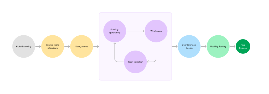
The FIFO system was invisible to users. During kickoff, the product manager flagged that customers routinely called customer service just to ask how much they owed, a signal that the app was failing at its most basic job. Instead of assuming why, I treated the support team as a data source.
Research method: Unstructured interviews with the customer service team, who handle payment queries daily. This gave me indirect access to hundreds of real user pain points without waiting for a formal research cycle.
Key finding: Pharmacists didn’t distrust the payment system on the app, they simply couldn’t see it. They had no way to verify which invoice a payment covered, so they defaulted to calling support or delaying payment entirely. Delayed payments directly threatened the platform’s credit-based business model.
User Journey Map – Turning interviews into decisions
I synthesized the CS interview data into personas and a user journey map. The map surfaced two critical moments of confusion:
- Before paying: users couldn’t confirm which invoices were due and for how much
- After paying: users couldn’t verify where their money went
This reframed the project: it wasn’t a “payment UI refresh,” it was a transparency and control problem. Every design decision that followed was evaluated against one question: does this help the user track and verify their invoices without contacting support?
UX design – From conceptual design to wireframes
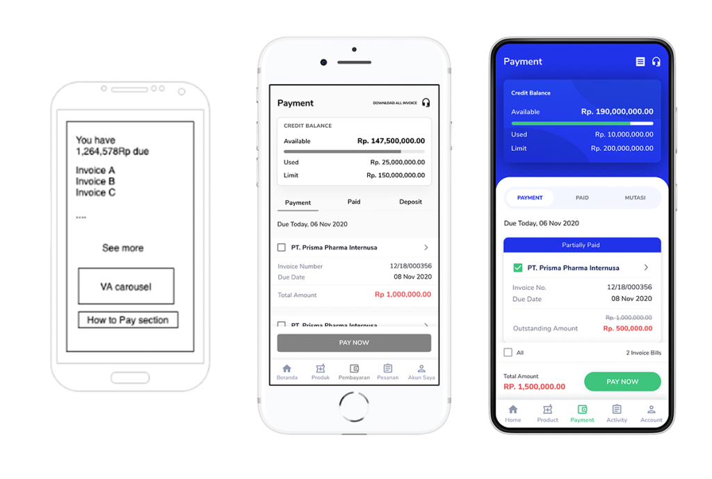
I translated the journey map into wireframes and built a low-fidelity interactive prototype in Figma. Rather than polishing first, I tested early with three internal groups; business, customer service, and development team to validate the invoice-selection model before investing in visual design. CS feedback was especially valuable: they could predict which screens would generate calls.
Key structural decisions from this phase:
- Selectable invoices replaced automatic FIFO allocation, giving users explicit control
- Outstanding amount shown per invoice, not just as a lump-sum balance
UI design: The solution layouts
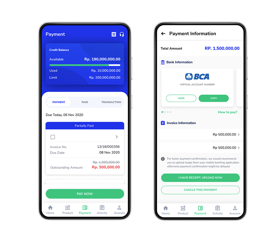
With the flow validated, I designed the high-fidelity prototype with the app’s new branding. The final design surfaces the credit balance (available / paid / deposit) at the top, lists due invoices as individually selectable cards with their outstanding amounts, and calculates the total before the user commits to paying.
User Testing – Let’s see what users think
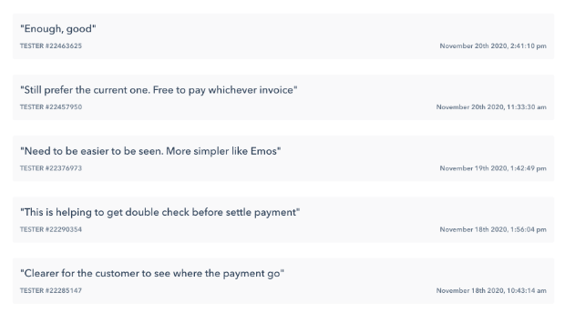
We conducted user testing sessions with the A/B test technique. The tests were done on a high-fidelity interactive prototype with Maze. The results were analyzed and presented to the stakeholders. Rather than picking a side, we iterated: the final design kept free invoice selection (addressing the flexibility concern) while simplifying the card layout (addressing the complexity concern). The A/B results gave stakeholders the evidence to approve the change confidently.
Results
Two years of Metabase data (2020 → 2022) confirmed the redesign worked: past-due invoices dropped to 0%. Users who could see and select their invoices paid them on time. The invoice allocation process, previously a top support-call driver, became self-service.
What I learned
- Support teams are an underused research goldmine. CS interviews got me to the core insight in days, not weeks.
- Test the model before the pixels. Validating the invoice-selection concept in low fidelity saved a full redesign cycle.
- Negative test feedback is a design input, not a verdict. The “prefer the old one” responses shaped the final solution rather than killing it.